Google’s decision to changes it’s logo has been an enigmatic story in design news however, the Wired breakdown of the new logo shares a bit of insight into the font that the company used and possible motives behind the change.
“The bold new logo preserves the old logo’s most recognizable element—the famous blue-red-yellow-blue-green-red color sequence—but presents the company’s name in a bespoke typeface called Product Sans inspired by schoolbook letter-printing,” said Margaret Rhodes of Wired.
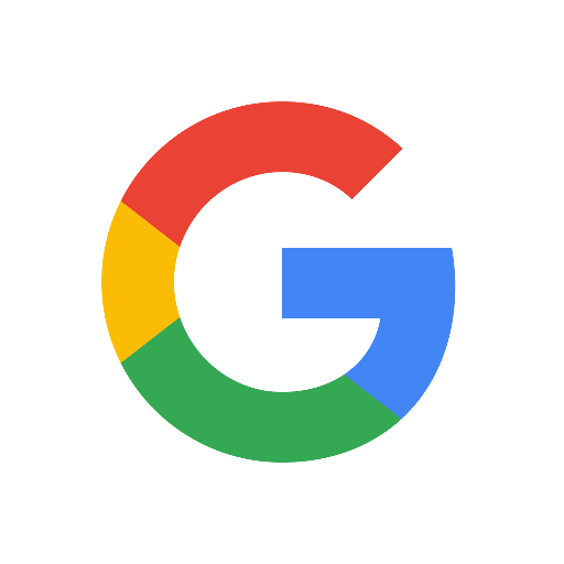
“The new wordmark will replace the one that’s appeared above the search box since 1999, but it’s much more extensible, too. Google also introduced a suite of sub-logos, like a four-color ‘G’ icon that’ll dot the Google app on phone homescreens, and a microphone icon that guides you through voice search. It’s a self-described“simple, friendly, and approachable” design.
Google has made plenty of logo changes in the past and it’s evident that the company started with a more three-dimensional design but have now accepted a more flat design. The slanted “e” grabs your attention much more than it did in previous designs and overall there is something a bit innocent about the logo.
“It’s really about much more than a logo, and more about kind of a smart system,” said Geoff Cook, a founding partner at Base Design, according to the report.
“That’s partly a nod to Alphabet, the newly minted holding company that now owns Google and has a slick and simple visual identity of its own. In creating Alphabet, Google executives introduced a new ecosystem—one that Google is part of, rather than one Google oversees.”
The new design is quite the change but some folks are applauding it’s simplicity and appeal while a few think it’s a big fail, but to each his own.
Read the full story.