Aspects of design are what fuels first impressions to any site or company and Google’s new Alphabet logo looks to be pointing towards a more mature look which is perfect for their parent company.
“Given the confusion surrounding the announcement, Alphabet’s visual identity plays a vital role helping people understand the differences between the two companies,” says Wired.
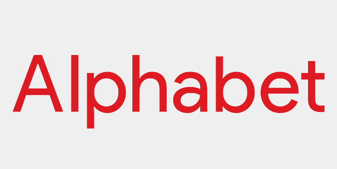
“Whereas Google’s goofy logo reflected a not-quite-mature web, Alphabet’s rational, bright red wordmark signals a growing-up phase. If Google’s logo reflects a campus with multi-story slides and themed conference rooms, Alphabet’s says, ‘I have a lobby full of Knoll furniture.'”
The new design completely distinguishes Alphabet from Google and rightfully so. Wired asked designers to explain the move and for the most part critics like Natasha Jen of Pentagram, Steven Heller, a design critic and Howard Belk, chief creative officer of Siegel+Gate agree that it’s a move towards maturity without completely giving up the playful aspect of design.
A lot of attention is draw to the lowercase a which much of the panel decided was the mark that kept the logo from being completely grown-up. While a lot of designers like the new logo, Tobia Frere-Jones a typographer, says the logo does have it’s fair share of improvements that can be made.
“I keep getting drawn back to this lowercase ‘a,’ which lacks the subtlety of the other forms, like it missed a week of letterform school,” said Frere-Jones.
“Strokes that completely enclose a small white space (like the ‘a’ and ‘e’) need to be thinned out a bit so they don’t appear to be heavier. But it doesn’t look like that allowance was made, so the bottom curve of the ‘a’ looks too heavy, and becomes another distraction.”
The lowercase “a” does in fact draw the viewers attention and stands out among the rest of the letters though the new logo is overall successful and points to a mature style for the company.
Read the full story.