When I started using the internet the entire experience was hardly user friendly. Websites consisted of just content with little in the way of designing how that information was displayed. Since then things have changed, and usability (the UI) and user experience (UX) have become a buzzwords that is a must on almost any project you start. In modern web design, making the right UX choices can be the difference between gaining a customer and losing one.
User Experience Should be Easy
It shouldn’t be annoying, or awkward, or complicated, it should be straight to the point. If you’re selling a product, make it clear that that’s what you’re doing. The product should take up the bulk of your page. If your website is about content, make it all about content. Make it accessible and make sure your content is the key point.

Quartz simplifies the user experience by having the content where you can see it, and it takes up a good 80% of the screen. On the sidebar we can see all the newest articles, providing users with a quick way to access new content. This means more time spent on the site.
On the top bar we have only the essentials. A bar that allows us to switch categories, the search function and, of course, twitter and facebook. The concentration here is on the content.

On the website for numbrs we have an instant call to action and a little interactive video playing in the background, giving the user not only reason to stay (the video adds a little appeal), but a way to find out exactly how to get the app and learn more about it.
It Should be Device Adapted
If I’m on a mobile device I expect it to be adapted for mobile viewing. That doesn’t just mean adapted by size or so the text fits on the screen, that means the device should be fully adapted for a mobile user. Take Mixel for example. Mixel is a nice little app that combines photos into collages.
On the desktop website we see an area for entering your phone number so you can be texted the link to download the app
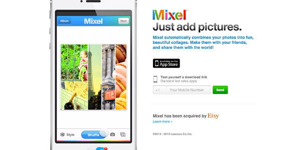
Mixel Website
On mobile devices however, this is gone and just the app download link is shown. This little addition might not seem like much, but greatly improves the user experience. Not only does it give the user a way to download the app if they’re away from their phone, it also is smart enough to realise that on your phone you don’t need to enter your mobile number.
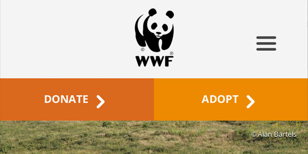
Most websites are work on mobile devices nowadays, but it’s a good thing to remember that not all mobile devices are touch, and some users have different resolution screens (see (designing for retina devices). The World Wildlife Federation website not only makes their website extremely accessible on mobile devices, but it makes it attractive too.
Good UX Means Good Design
Good UX is dependent on good design. The user experience is improved by a good design. Good fonts, font icons, clickable buttons and responsive design with good colours all go towards giving the user a good experience.
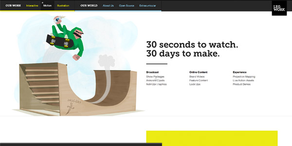
Good animations and fun characters help add to the user experience on Leg Work Studio’s website. The user will probably stick around a check out what’s going on. Leg Work Studios is a creative studio that makes illustrations and stuff like that. People on their website will stick around not only because their website is fun but because their website matches their content and what they’re trying to sell.
Websites Should Respond
There was a time when websites did not respond to user interaction, content was just content with very little input from the user. Things are slowly beginning to change though with the onset of gesture driven design on mobile devices, and interactivity in the form of Javascript libraries like jQuery.
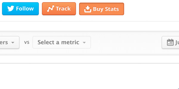
This isn’t anything complicated, just simple ‘push in’ buttons like those found on twitter counter (above) is enough to give a sense of realism and depth to a website. Hover effects, sliding sidebars, and even (in certain cases) headers that attach to the top of the screen can all add to making a website feel more real and alive.
On that note, optimizing your CSS to adapt to a user’s need is also a must. Things like using em’s (which will use the font size specified by the browser making your font sizes more device compatible) and percentages will make your site more resizable if a user has poor vision or needs to alter zoom. In the future we’ll be able to use other units as specified in new CSS specifications, such as vw (viewport width) and vh (viewport height), hopefully giving us more room to optimize the user experience.
Summary
The best practices are not only good for users, but they’re good for you. Applying these methods increases revenue and turnover while creating what users have come to expect of web applications: good, intuitive and usable design. User experience is not an optional extra that can be glossed over, but one which you should be trying to implement in every single project you do.
There is no single one size fits all solution for UX, it’s something that has to be specifically decided based on the goals of your project. Therein lies the job of a web designer, to create an experience that is memorable and useful for a user, and one which gets the point of the information across in a way which is both aesthetically pleasing and easy to use.


