When it comes to mobile devices it can be quite difficult to come up with a menu that works well in most circumstances. In this tutorial we’ll be tackling this issue and how to create a fully functional mobile menu with swipe gestures so the user can swipe from left to right and reveal the menu, and we’ll be doing this by just using some jQuery and CSS.
Options
We have a few options, although space is limited. The first is a list style menu which is typical on desktop. That means just a regular bar with our options. This is good, but not for a website with even a slightly complex navigation system.

The navigational style that is being used more and more often on mobile devices looks more like this, with a drop down of some sort showing all available navigational links.
This is a pretty good idea because:
- 1. It is simplistic and takes up little space
- 2. All possible navigations can be shown
- 3. It only activates the menu if the user wants it, this is good because:
- It activates when the user wants the menu, and becomes the center of attention
by taking up the most space - It doesn’t appear before the user clicks it meaning we can fill all the room that was
previously filled with menu with more useful content
- It activates when the user wants the menu, and becomes the center of attention
- 4. It’s pretty and better than the alternatives
Accomplishing this
There are two kinds of drop downs that we can make. The first is pretty straight forward, just a regular drop down that we can do pretty easily with jQuery. First off start with a base HTML template that looks like this:
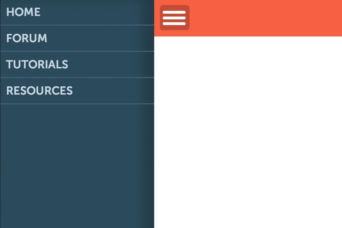
<div id="main-container">
	<div id="sub-container">
		<div class="top-bar">
			<div id="menu-icon">
				<div class="bar"> </div>
				<div class="bar"> </div>
				<div class="bar"> </div>
			</div>
			<div id="content">

				<!-- MORE CONTENT GOES HERE.. -->

			</div>
		</div>
	</div>
</div>

<div class="drop-down">
	<ul>
		<li>HOME</li>
		<li>FORUM</li>
		<li>TUTORIALS</li>
		<li>RESOURCES</li>
	</ul>
</div>
The .drop-down div contains our menu that we want to slide out. It’s up to you how you style them but using this we can use a little jQuery like this to create the desired effect:
$(document).ready(function() {

	var i = false;

	$('#menu-icon').click(function() {

		$('.drop-down').stop(true, false).slideToggle(200);

	});

});
I don’t want to dwell on this too long as the next method is perhaps the more interesting. The files for this method can be found in the download.
Slide in, Slide Out
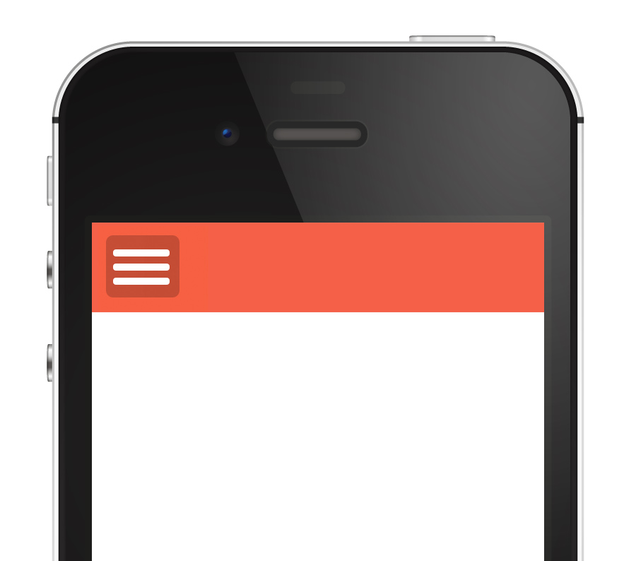
By far the nicest way to do this is with a slide out menu which will slide out when the user clicks the button. Using a few jQuery tricks we can also get this to work when the user does a gesture, i.e. a swipe to the right will result in the menu sliding out.
We start with the same HTML template as before and the following CSS. I’ve commented any points of interest.
body {
	margin: 0;
	font-size: 62.5%;
	padding: 0;
}

.top-bar {
	background-color: #f46149;
	padding: 10px;
}

#main-container {
	width: 100%;
	overflow: scroll; /* Overflow should scroll */
	left: 0px;
	-webkit-overflow-scrolling: touch; /* This gives us scrollbars. */
	position: fixed; /* This means we don't have to worry about overflow issues */
	-webkit-transition: left 0.2s ease-in;
	transition: left 0.2s ease-in;
}

#sub-container {
	position: relative;
}

#content {
	font-size: 1.5em;
	box-sizing: border-box;
	text-align: justify;
	box-sizing: border-box;
	-moz-box-sizing: border-box;
}

.menu-icon {
	padding: 5px 7px 9px 5px;
	border-radius: 5px;
	background: rgba(0,0,0,0.2);
	cursor: pointer;
	display: inline-block;
	width: 40px;
	height: 30px;
	float: left;
}

.menu-icon .bar {
	background: white;
	border-radius: 5px;
	width: 40px;
	height: 5px;
	margin: 5px 0 0 0;
}

.slide-in {
	background-color: #2d4b5a;
	width: 270px;
	position: absolute;
	box-shadow: inset -20px 0 30px rgba(0,0,0,0.2);
	top: 0;
	left: -270px;
	-webkit-transition: left 0.2s ease-in;
	transition: left 0.2s ease-in;
}

.slide-in ul {
	list-style: none;
	padding: 0;
	margin: 0;
}

.slide-in ul li {
	padding: 10px;
	font-weight: bold;
	font-size: 2em;
	border-bottom: 2px solid #3d6071;
	color: #c4d6e0;
}

.slide-in ul li:hover {
	background-color: #3d6071;
	color: #fff;
}

.slide-in.on {
	left: 0px !important;
}

#main-container.on {
	left: 270px !important;
}
With jQuery we’re going to be taking advantage of touch based events. Don’t worry though, we have a backup plan (the button) if the user’s device is not touch. To begin we have to define the height of the slide out menu. It’s going to be the same size as the user’s viewport height. We also need to take into consideration resizing of the device, so we’re going to run this every time the user resizes the window. I’ve also defined a few variables which will act to store information we will be getting when the user touches the screen.
$(document).ready(function(e) {

	var startX, curX, startY, curY; // Variables
	var newXScroll, newYScroll, genXScroll; // More Variables!

	// Change the height of the sidebar, as well as a few things to do with the main content area, so the user
	// can actually scroll in the content area.
	function sideBarHeight() {

		var docHeight = $(document).height();
		var winHeight = $(window).height();

		$('.slide-in').height(winHeight);
		$('#main-container').height(winHeight);
		$('#sub-container').height($('#sub-container').height());
	}

	// Run the function on resize and when the page loads!
	$(window).resize(function() {
		sideBarHeight();
	}); sideBarHeight();
Next we’re going to use a plugin called Hammer.js. This will take care of all our gesture related woes. Go ahead and include it in the head of your document. We create a gesture for swipeleft, and one for swiperight. Then we’re going to add a class called on which will deal with those gestures.
		var outIn = 'in';

	Hammer(document.getElementById('main-container')).on('swiperight', function(e) {
			$('.slide-in').toggleClass('on');
			$('#main-container').toggleClass('on');
			outIn = 'out';

	});

	Hammer(document.getElementById('main-container')).on('swipeleft', function(e) {
			$('.slide-in').toggleClass('on');
			$('#main-container').toggleClass('on');
			outIn = 'in';
	});


	function runAnimation() {

		if(outIn == 'out') {

			$('.slide-in').toggleClass('on');
			$('#main-container').toggleClass('on');
			outIn = 'in';

		} else if(outIn == 'in') {

			$('.slide-in').toggleClass('on');
			$('#main-container').toggleClass('on');
			outIn = 'out';

		}

	}
Using the X coordinate movement we can figure out what way the user moved their finger, and whether to show the sidebar or not after the user lifts their fingers.
And finally, we show the sidebar when the user clicks on the menu icon too!
	function runAnimation() {

		if(outIn == 'out') {

			$('.slide-in').toggleClass('on');
			$('#main-container').toggleClass('on');
			outIn = 'in';

		} else if(outIn == 'in') {

			$('.slide-in').toggleClass('on');
			$('#main-container').toggleClass('on');
			outIn = 'out';

		}

	}

	$('.menu-icon')[0].addEventListener('touchend', function(e) {
		$('.slide-in').toggleClass('on');
		$('#main-container').toggleClass('on');
	});

	$('.menu-icon').click(function() {
		$('.slide-in').toggleClass('on');
		$('#main-container').toggleClass('on');
	});
You can download that version in the download as well, or check out the demo. Hope you’ve enjoyed this tutorial, feel free to use this on any of your future projects!
UPDATE – after some discussion, I decided to update this to use transitions rather than Javascript animations. Hopefully things will run smoother.
UPDATE 2 (17 Jun): after some consideration I have removed the ‘snaps’ demo as it doesn’t seem to work so great on Android devices. I’ve included a 3rd party gesture plugin that will hopefully solve most problems, and updated the code.


