Responsive Design
In case you haven’t heard already, the big thing at the moment is responsive design. Everything has to be responsive in some way, so it’ll work on what is becoming an increasingly huge portion of traffic: mobile devices. Once the user is on your site though, how does one make the most out of their experience? Today I’m going to show you a bunch of things which aren’t in the spotlight when it comes to mobile design, but could really improve experience.
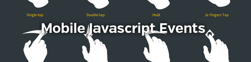
On Touch
You may have heard of event handlers. They handle how a browser responds to an event. So you can add an event handler for clicking, for hovering, and for touching on a touch screen. What we’re going to look at is how we can handle a touch, since most modern phones have a touch screen. There are three main handlers for handling how a user touches the screen:
| touchstart | Does something when the user touches the screen |
| touchend | Does something when the user lifts their finger up |
| touchmove | Does something when the user moves their finger while touching |
What does it all mean?
So what can we do with all this stuff? Well first of all, we can tell the mobile browser to check if the user is touching the screen:
<script type="text/javascript">

function thatFunction(e) {
	document.write("hello!");
}

addEventListener('touchstart', thatFunction, false);

</script>
Now when the user touches the screen we change the content to just ‘hello!’. The browser ‘listens’ for when the user touches the screen (touchstart) and then runs thatFunction(). Pretty cool, huh?
Gathering Information
So that’s great, but how do we actually turn this into something useful? There are a few properties which let you do this, that will gather information on finger positions:
| touches | Initial positions of fingers |
| ChangedTouches | Information when the user moves their fingers on the screen. |
| targetTouches | Information within a certain target. |
Each of these will return information on finger postions allowing you to manipulate what happens when the user touches the page. They all carry the following information:
- screenX: X position on the screen in its entirety.
- screenY: Y position on the screen in its entirety.
- clientX: X position excluding scroll bars, in the current viewport.
- clientY: Y position excluding scroll bars, in the current viewport.
- pageX: X position including scroll bars.
- pageY: Y position including scroll bars.
- identifier: A unique identifier.
- target: The current element that is being touched.
To access this information you’d do the following:
function someFunction(e) {

    var touch = e.touches[0]; // Gets information about the first finger, i.e. number 0.
    var scrX = touch.pageX; // Get X position including scroll bars

}
Easy, huh? Remember, changedTouches has to be used if you want to know where the user is moving. You could then initiate this function with a listener, say, when the user touches the screen:
// Add to Javascript
addEventListener('touchstart', someFunction, false);
That’s the barebones of how this works. The great thing about this is it lets you create mobile specific events, or at least touch screen specific, so you could create a script that does gestures and things like that. Hopefully I’ll be able to cover that in a future tutorial.
Time for an Experiment!
So I put together this little experiment. If you have a touchable device nearby you can test it out. Every time you drag your finger divs will be created, which will be a different colour depending on how many fingers you have on the screen. One finger is blue, two is purple, and three is red. Your initial finger can be dragged across the screen to ‘paint’ with the divs. Read the comments for a little more insight.
addEventListener('touchmove', function(e) { // When the user moves their finger, the function will begin.

	e.preventDefault(); // Stop any annoying scrolling.

	var touch = e.touches[0]; // Fires every time the user moves.

	var posY = touch.pageY - 25; // Get the Y position (-25 to center)
	var posX = touch.pageX - 25; // Get the X position (-25 to center)

	if(e.touches.length == 1) { // If one finger is touching

		// Creates div at current position of finger
		// -----------------------------------------

		var blue = document.createElement('div');
		blue.setAttribute('class', 'blue');

		blue.style.top = posY+'px';
		blue.style.left = posX+'px';

		document.body.appendChild(blue);

	}

	if(e.touches.length == 2) { // If two fingers are touching

		var purple = document.createElement('div');
		purple.setAttribute('class', 'purple');

		purple.style.top = posY+'px';
		purple.style.left = posX+'px';

		document.body.appendChild(purple);

	}

	if(e.touches.length == 3) { // If three fingers are touching

		var red = document.createElement('div');
		red.setAttribute('class', 'red');

		red.style.top = posY+'px';
		red.style.left = posX+'px';

		document.body.appendChild(red);

	}

}, false);
Then just add a bit of HTML (in the head of your document) to assure the viewport is correct:
<meta name="viewport" content="initial-scale = 1.0,maximum-scale = 1.0" />
And some CSS so the circles actually appear:
body {
	padding: 0;
	margin: 0;
}


.blue {
	width: 50px;
	height: 50px;
	position: absolute;
	background: blue;
	border-radius: 200px;
}

.purple {
	width: 50px;
	height: 50px;
	position: absolute;
	background: purple;
	border-radius: 200px;
}

.red {
	width: 50px;
	height: 50px;
	position: absolute;
	background: red;
	border-radius: 200px;
}
Check out the demo below so you can get an idea of how you could use these to create a more interactive experience on mobile devices. It can be a bit laggy if you use it for ages, but hopefully it gives you an example of what can be accomplished! I might do more posts (slide to go back, anyone?) if I get the time on this topic. Stay tuned!

