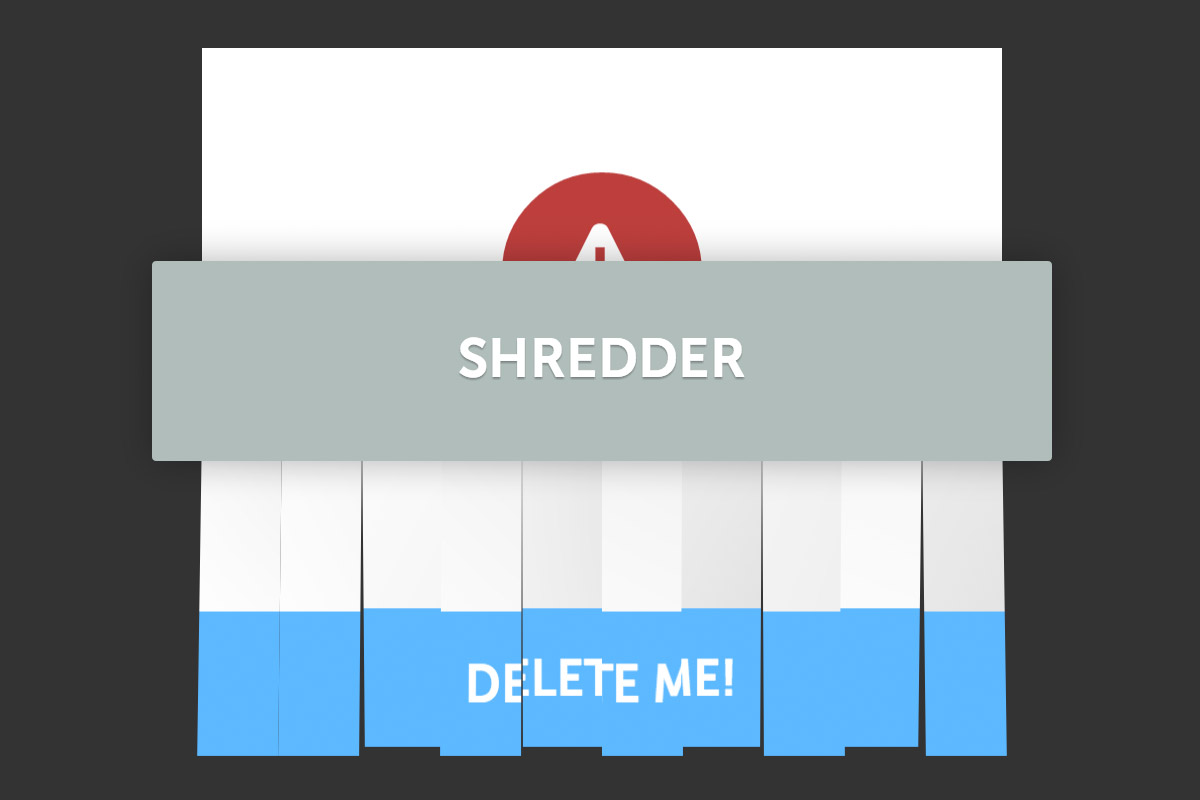
I saw this little animation for an application on iPhone where when you pressed delete, the element you were deleting was literally shred up by a shredder. I thought this was a fantastic idea and started working to see if I could do this effect with just CSS, and it’s possible! We’ll be using 3D Transforms, Animations and the notorious CSS clip property to do this effect.
I’ve also added the tiniest bit of jQuery so that we can have the animation run when the user presses ‘delete’. We can have the animation run without any jQuery, it’s just this way we can control when we want the animation to fire. Let’s begin!
How do we do this?
So how do we do this? Well it’s a little bit tricky to pull off, and quite the illusion. We want to effectively have 10 strips of our content. We can do that with the CSS clip property. What it does is clips content into a rectangle based on some numbers you give it. That way we can take our content and turn it into a strip.
clip: rect(0,40px,300px,0);
Then it’s just a matter of duplicating the strips, so we duplicate the content and then change the position of the clip so we end up with 10 strips (or something like that). We then apply a few background effects (like gradients) so that when we apply some transforms later the strips will appear as though they’re overlapping each other. So now we have all these weird background-changed strips, what do we do now?
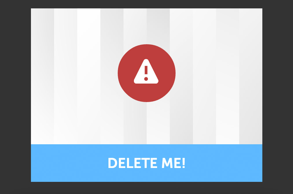
Notice the 10 different pieces using clip
Well we make another, unclipped version of our content and stick it on top (everything will be set to position: absolute) so it will all appear as one single piece). This unclipped version will act as a cover up, which we will slowly unveil revealing the individual strips as it passes through the the shredder, and our illusion is complete! It appears as though the paper has been cut up into 10 pieces by this div, but we know the truth.
Our HTML therefore looks a little like this, with the same content in each part. The content div is the cover (the unclipped content), and each part is a different slice:
<div class="shredded-paper tk-museo-sans">
	<div class="content">
		<div class="alert">
			<i class="ss-alert"> </i>
		</div>
		<div class="shred-me">
			DELETE ME!
		</div>
	</div>
	<div class="part-1">
		<div class="alert">
			<i class="ss-alert"> </i>
		</div>
		<div class="shred-me">
			DELETE ME!
		</div>
	</div>
	<div class="part-2">
		<div class="alert">
			<i class="ss-alert"> </i>
		</div>
		<div class="shred-me">
			DELETE ME!
		</div>
	</div>
	<div class="part-3">
		<div class="alert">
			<i class="ss-alert"> </i>
		</div>
		<div class="shred-me">
			DELETE ME!
		</div>
	</div>
	<div class="part-4">
		<div class="alert">
			<i class="ss-alert"> </i>
		</div>
		<div class="shred-me">
			DELETE ME!
		</div>
	</div>
	<div class="part-5">
		<div class="alert">
			<i class="ss-alert"> </i>
		</div>
		<div class="shred-me">
			DELETE ME!
		</div>
	</div>
	<div class="part-6">
		<div class="alert">
			<i class="ss-alert"> </i>
		</div>
		<div class="shred-me">
			DELETE ME!
		</div>
	</div>
	<div class="part-7">
		<div class="alert">
			<i class="ss-alert"> </i>
		</div>
		<div class="shred-me">
			DELETE ME!
		</div>
	</div>
	<div class="part-8">
		<div class="alert">
			<i class="ss-alert"> </i>
		</div>
		<div class="shred-me">
			DELETE ME!
		</div>
	</div>
	<div class="part-9">
		<div class="alert">
			<i class="ss-alert"> </i>
		</div>
		<div class="shred-me">
			DELETE ME!
		</div>
	</div>
	<div class="part-10">
		<div class="alert">
			<i class="ss-alert"> </i>
		</div>
		<div class="shred-me">
			DELETE ME!
		</div>
	</div>
</div>
First off, a little CSS which will define the animations.
body {
	background: #333;
	overflow: hidden;
	font-family: sans-serif;
	padding: 0;
	margin: 0;
}

.animate-shredded-paper {
	-webkit-animation: shredGo 3.5s 1 forwards;
	animation: shredGo 3.5s 1 forwards;
}

.animate-content {
	animation: cover 2.6s 1 forwards 1s;
	-webkit-animation: cover 2.2s 1 forwards 1s;
}

.shredded-holder-animate {
	animation: shredShake 0.12s 26 0.5s;
	-webkit-animation: shredShake 0.12s 26 0.5s;
}

.shredded-paper-p-animate {
	animation: Animation1 3.6s 1 forwards 1s;
	-webkit-animation: Animation1 3.6s 1 forwards 1s;
}

.shredded-paper-q-animate {
	animation: Animation2 3.6s 1 forwards 1s;
	-webkit-animation: Animation2 3.6s 1 forwards 1s;
}
These animations will be added to stuff when we’re using jQuery. Alternatively, we can just add them straight to the CSS although then we’d have no control of when they were fired. When we say shredShake 0.12s 26 0.5s we’re saying, run the animation shredShake for 0.12 seconds, 26 times with a delay of 0.5 seconds. An animation is defined using keyframes, and since webkit requires the prefix, we need to have two of every animation (annoying, I know). The animations look like this:
@-webkit-keyframes shredGo {
	10% { top: 20px; }
	12% { top: 15px; }
	30% { top: 150px; }
	32% { top: 145px; }
	60% { top: 320px; }
	62% { top: 315px; }
	68% { top: 380px; }
	100% { top: 400px; }
}

@keyframes shredGo {
	10% { top: 20px; }
	12% { top: 15px; }
	30% { top: 150px; }
	32% { top: 145px; }
	60% { top: 320px; }
	62% { top: 315px; }
	68% { top: 380px; }
	100% { top: 400px; }
}

@-webkit-keyframes shredShake {
	50% { top: 352px; }
	100% { top: 348px; }
}

@keyframes shredShake {
	50% { top: 352px; }
	100% { top: 348px; }
}

@-webkit-keyframes cover {
	30% { top: -25px; }
	80% { height: 20%; }
	100% { top: 0; height: 0; }
}

@keyframes cover {
	30% { top: -25px; }
	80% { height: 20%; }
	100% { height: 0; top: -5px; }
}

@keyframes Animation1 {
	20% { transform: scaleY(1.1) rotateX(5deg); }
	50% { transform: scaleY(1.1) rotateX(-5deg); top: 0; }
	90% { transform: scaleY(1.1) rotateX(10deg); top: 400px; }
	100% { transform: scaleY(1.1) rotateX(10deg); top: 1200px; }
}

@-webkit-keyframes Animation1 {
	20% { -webkit-transform: scaleY(1.1) rotateX(5deg); }
	50% { -webkit-transform: scaleY(1.1) rotateX(-5deg); top: 0; }
	90% { -webkit-transform: scaleY(1.1) rotateX(10deg); top: 400px; }
	100% { -webkit-transform: scaleY(1.1) rotateX(10deg); top: 1200px; }
}

@keyframes Animation2 {
	20% { transform: scaleY(1.1) rotateX(-5deg); }
	50% { transform: scaleY(1.1) rotateX(-5deg); top: 0; }
	90% { transform: scaleY(1.1) rotateX(-10deg); top: 400px; }
	100% { transform: scaleY(1.1) rotateX(-10deg); top: 1200px; }
}

@-webkit-keyframes Animation2 {
	20% { -webkit-transform: scaleY(1.1) rotateX(-5deg); }
	50% { -webkit-transform: scaleY(1.1) rotateX(-5deg); top: 0; }
	90% { -webkit-transform: scaleY(1.1) rotateX(-10deg); top: 400px; }
	100% { -webkit-transform: scaleY(1.1) rotateX(-10deg); top: 1200px; }
}
Then the next step is to style everything else. It’s all pretty simple CSS from here. I’ve styled every slice individually so that we can get the background effects that we want, and also because we need to clip it in a certain way.
.shredded-paper {
	width: 400px;
	height: 300px;
	position: absolute;
	-webkit-perspective: 1000px;
	perspective: 1000px;
	left: 525px;
	top: 20px;
	z-index: 5;

}

.shredded-paper > div[class^='part-'] {
	height: 100%;
	width: 100%;
	box-sizing: border-box;
	-moz-box-sizing: border-box;
	position: absolute;
	-webkit-transform-style: preserve-3d;
	transform-style: preserve-3d;
	z-index: 99;
	top: 0;

}

.shredded-paper > .content {
	background: #fff;
	height: 100%;
	overflow: hidden;
	box-sizing: border-box;
	width: 100%;
	-moz-box-sizing: border-box;
	position: absolute;
	-webkit-transform: translateZ(180px) scale(0.82);
	top: 0;
	z-index: 9999;
}

.shredded-paper .part-1 {
	clip: rect(0,40px,300px,0);
	background: #fff;
	background: -webkit-radial-gradient(32% 97%, 29% 62%, rgba(0,0,0,0.3), rgba(255, 255, 255, 0)) #fff;
	background: radial-gradient(circle at 64% 0% , rgb(134, 134, 134), rgba(255, 255, 255, 0)) repeat scroll 0% 0% rgb(255, 255, 255);
}
.shredded-paper .part-2 {
	clip: rect(0,80px,300px,40px);
	background: #fff;
	background: -webkit-radial-gradient(28% 11%, 16% 62%, rgba(0,0,0,0.3), rgba(255,255,255,0)) #fff;
	background: radial-gradient(circle at 109% 0% , rgb(134, 134, 134), rgba(255, 255, 255, 0)) repeat scroll 0% 0% rgb(255, 255, 255);
}
.shredded-paper .part-3 {
	clip: rect(0,120px,300px,80px);
	background: #fff;
	background: -webkit-radial-gradient(12% 88%, 23% 62%, rgba(0,0,0,0.3), rgba(255,255,255,0)) #fff;
	background: radial-gradient(circle at 167% 173% , rgb(134, 134, 134), rgba(255, 255, 255, 0)) repeat scroll 0% 0% rgb(255, 255, 255);
}
.shredded-paper .part-4 {
	clip: rect(0,160px,300px,120px);
	background: #fff;
	background: -webkit-radial-gradient(73% 9%, 65% 52%, rgba(0,0,0,0.3), rgba(255, 255, 255, 0)) #fff;
	background: radial-gradient(circle at 118% -54% , rgb(134, 134, 134), rgba(255, 255, 255, 0)) repeat scroll 0% 0% rgb(255, 255, 255);
}
.shredded-paper .part-5 {
	clip: rect(0,200px,300px,160px);
	background: #fff;
	background: -webkit-radial-gradient(23% 97%, 29% 62%, rgba(0,0,0,0.3), rgba(255,255,255,0)), -webkit-radial-gradient(72% 20%, 29% 62%, rgba(0,0,0,0.3), rgba(255,255,255,0)) #fff;
	background: radial-gradient(circle at 127% 57% , rgb(134, 134, 134), rgba(255, 255, 255, 0)) repeat scroll 0% 0% rgb(255, 255, 255);
}
.shredded-paper .part-6 {
	clip: rect(0,240px,300px,200px);
	background: #fff;
	background: -webkit-radial-gradient(85% 97%, 46% 57%, rgba(0,0,0,0.3), rgba(255, 255, 255, 0)) #FFF;
	background: radial-gradient(circle at 116% -103% , rgb(134, 134, 134), rgba(255, 255, 255, 0)) repeat scroll 0% 0% rgb(255, 255, 255);
}
.shredded-paper .part-7 {
	clip: rect(0,280px,300px,240px);
	background: #fff;
	background: -webkit-radial-gradient(85% 24%, 29% 62%, rgba(0,0,0,0.3), rgba(255,255,255,0)) #fff;
	background: radial-gradient(circle at 155% 143% , rgb(134, 134, 134), rgba(255, 255, 255, 0)) repeat scroll 0% 0% rgb(255, 255, 255);
}
.shredded-paper .part-8 {
	clip: rect(0,320px,300px,280px);
	background: #fff;
	background: -webkit-radial-gradient(104% 93%, 46% 52%, rgba(0,0,0,0.3), rgba(255, 255, 255, 0)) #FFF;
	background: radial-gradient(circle at 241% 154% , rgb(134, 134, 134), rgba(255, 255, 255, 0)) repeat scroll 0% 0% rgb(255, 255, 255);
}
.shredded-paper .part-9 {
	clip: rect(0,360px,300px,320px);
	background: #fff;
	background: -webkit-radial-gradient(39% 18%, 73% 52%, rgba(0,0,0,0.3), rgba(255, 255, 255, 0)) #FFF;
	background: radial-gradient(circle at 170% -219% , rgb(134, 134, 134), rgba(255, 255, 255, 0)) repeat scroll 0% 0% rgb(255, 255, 255);
}
.shredded-paper .part-10 {
	clip: rect(0,400px,300px,360px);
	background: #fff;
	background: -webkit-radial-gradient(77% 97%, 29% 62%, rgba(0,0,0,0.3), rgba(255,255,255,0)) #fff;
	background: radial-gradient(circle at 217% 150% , rgb(134, 134, 134), rgba(255, 255, 255, 0)) repeat scroll 0% 0% rgb(255, 255, 255);
}

.shredder-holder {
	position: relative;
	top: 350px;
	left: 500px;
	width: 450px;
}

.shredder {
	font-weight: bold;
	font-size: 1.7em;
	text-shadow: 0 1px 1px rgba(0, 0, 0, 0.3);
	padding: 33px 0;
	box-sizing: border-box;
	-moz-box-sizing: border-box;
	position: absolute;
	background: #FF0012;
	width: 100%;
	border-radius: 2px;
	height: 100px;
	box-shadow: 0 0 30px rgba(0, 0, 0, 0.3);
	z-index: 9999999;
	background: rgba(176, 189, 186, 1);
	text-align: center;
	color: #FFF;
}

.shred-me {
	font-weight: bold;
	background: #61BAFF;
	color: #FFF;
	cursor: pointer;
	width: 100%;
	display: inline-block;
	text-align: center;
	box-sizing: border-box;
	-moz-box-sizing: border-box;
	padding: 18px 10px;
	font-size: 1.5em;
	position: absolute;
	top: 235px;
}

.shred-me:hover {
	background: rgb(30, 112, 176);
}

.shred-me:active {
	box-shadow: inset 0 2px 10px rgba(0,0,0,0.3);
}

.alert {
	padding: 23px 20px 20px 28px;
	border-radius: 100px;
	background: #BB4040;
	color: #FFF;
	font-size: 2.6em;
	width: 100px;
	height: 100px;
	box-sizing: border-box;
	-moz-box-sizing: border-box;
	margin: 10px auto;
	z-index: 999;
	position: relative;
	top: 52px;
	z-index: 999;
	position: relative;
	top: 52px;
}
And that’s it. Go check out the demo. This effect works in all major browsers, plus, what’s cooler than shredding a document you want to delete?
There are a few issues with opera because it doesn’t support 3D transforms (as in the shreds wont rotate), but Opera will support that pretty soon since it’s switching to Google’s webkit derived Blink engine. I hope you’ve enjoyed this tutorial and have a good day!
