When we create stuff for the web now it’s important we remember that the web has spread from the trackpad and mouse to the touch screen. Sometimes this is hard to accomodate for, but it’s not that hard to create some awesome cross device friendly touch and drag events with HTML5 and some smart styling!
Getting Started
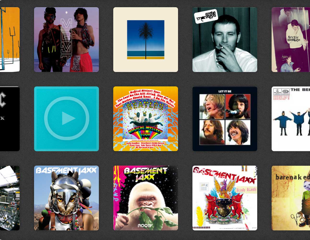
I’ve made a little plugin that lets you grab and drag your way through a bunch of pictures of album artwork, similar to you drag through objects on an iphone at the start screen. Check out the demo to get a feel for what we’re going to be creating. The plugin isn’t too difficult to understand and you can download the finished version above, but when I first designed it, it only worked with mouse drags.
$this.mousemove(function() {

});
So first off we need to alter this so that it’s mobile compatible. That’s not too difficult to do, we just need to use bind and we can bind multiple event handlers to a single element using the same function. Chances are the function you’re using isn’t going to be changing that significantly from mobile to desktop so this is quite beneficial.
$this.bind('mousemove touchmove', function() {

});
Voila! Now our function is totally compatible with mobiles. In our particular plugin we have to check where the user is clicking in the object. Usually this would be done with e.pageX but on mobile it’s a little more complicated. This is what I initially wrote (for desktop only compatibility):
firstPositionX = e.pageX - $this.offset().left;
This is the first position the user clicks. Now when it comes to mobile, this will be undefined. So all we have to do is say if e.pageX is undefined, then use the mobile version of e.pageX:
if(e.pageX == undefined) firstPositionX = e.originalEvent.touches[0].pageX - $this.offset().left;
else firstPositionX = e.pageX - $this.offset().left;
Adjusting the CSS
Now the next problem is that the interface is still scaled for desktop screens. To fix that we need to alter the CSS a little. On a mobile device, we should ignore all default settings and just set the width to the width of the device. We also need to alter the padding a little.
@media only screen and (max-device-width: 480px) {

	.drag {
		width: 100% !important;
		height: 100% !important;
		border-radius: 0;
		margin: 0 !important;
	}

	.drag .item {
		margin: 7px 11px;
		opacity: 1;
	}

}
And now we have something that will work on most devices!
How the plugin works
The plugin provides a way to use your mouse to drag a bunch of icons in a similar fashion to what you’d expect on an iPhone. It has a bunch of settings and can be further customized with CSS. To use the plugin all you have to do is include it and a jQuery file file and then run this little snippet of Javascript:
$(document).ready(function() {

	$('.content').dragSensitive({

		// The length of every row. Default is 10 items per row
		rowLength : 10,

		// The default width of the box.
		boxWidth  : 500,

		// The default height of the box.
		boxHeight : 500,

		// The rate at which grabbing pans across items
		// The default is 1.3. Increasing makes it go slower.
		rate      : 1.3,

		// Sets whether or not the UI will snap to the last
		// element when the user stops grabbing
		round     : true,

		// This amount a user can drag (in pixels) while still
		// being able to click an object. Usually clicking is
		// disabled on drag, but within a (by default) 20px movement
		// clicking will still be enabled
		mistake   : 20

	});

});
The settings do not have to be altered, and in fact you can run the plugin without even mentioning them, but they are shown above for reference. Your HTML would then look something like this:
<div class="content">
	<div class="item"> <div class="itemcontent"><a href="hey!">Some Content</a></div> </div>
	<div class="item"> </div>
	<div class="item"> </div>
	<div class="item"> </div>
	<div class="item"> </div>
	<div class="item"> </div>
	<div class="item"> </div>
	<div class="item"> </div>
	<!-- .. Etc, etc. ------>
</div>
Each item represents a single icon or block in your drag box. If you put a div with the class itemcontent inside an item this content will be shown on the back of the icon when it flips over. Otherwise a generic play button will be shown.
You can download the files required to run this (I’ve annotated the code so you can understand what’s happening), or alternatively just check out the demo. I have tested this in the latest version of all browsers and it seems to work fine. Feel free to ask any questions in the comments, and have a good day!


