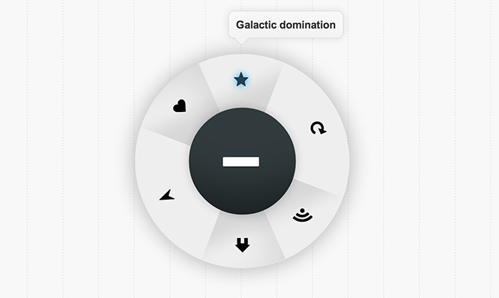
Over the past few days I’ve been messing around with transitions and transforms and managed to come up with this little menu. It incorporates a bunch of different CSS techniques, but is very experimental! The original idea was to have a button you pressed, which then launched a secondary ring to pop out which contained the menu items. Read on to find out how I made it!
It uses a lot of CSS3 but surprisingly works quite well in many browsers. The main problem is with opera, which runs into a few problems when trying to run the code (due to lack of support for transforms). Ignoring the lack of transitions in Internet Explorer 9, this will work in the latest version of all browsers sans Opera.
With just CSS!
To accomplish this effect we had to use a few of the quirks CSS has. Firstly we have to set up the HTML. We’re going to put some checkboxes and radio buttons in there too which (later) we’ll use in tandem with CSS to check if the user has ticked them. We can then have a label anywhere else in the code that links up to those corresponding radio buttons, and use the labels as block elements to design normally. Then it’s just a small step to use .checkbox:checked to alter the CSS of other elements on click.
For this particular menu I am using an icon font set called Symbolset. If you can’t get that, you can use image icons or download a free alternative (Check out our icon font post if you’re looking for free alternatives). The HTML for the menu is below:
<div id="menu">

	<input type="checkbox" id="on-check" name="on-check" />

	<label id="on-button" for="on-check">
		<span><span class="ss-plus"><!-- Put plus icon here if not using symbol set --></span></span>
		<span><span class="ss-hyphen"><!-- Put minus icon here if not using symbol set --></span></span>
	</label>

	<input type="radio" id="info-home" name="radio-check" />
	<input type="radio" id="info-compass" name="radio-check" checked />
	<input type="radio" id="info-heart" name="radio-check" />
	<input type="radio" id="info-rss" name="radio-check" />
	<input type="radio" id="info-refresh" name="radio-check" />
	<input type="radio" id="info-star" name="radio-check" />

	<div id="menu-items">
		<div class="middle">
			<div class="top">
				<span class="bg-piece"> </span>
				<label class="ss-home" for="info-home"><!-- Put home icon here if not using symbol set --></label>
				<span class="bg-piece"> </span>
				<label class="ss-compass" for="info-compass"><!-- Put compass icon here if not using symbol set --></label>
				<span class="bg-piece"> </span>
				<label class="ss-heart" for="info-heart"><!-- Put heart icon here if not using symbol set --></label>
			</div>
			<div class="bottom">
				<span class="bg-piece"> </span>
				<label class="ss-rss" for="info-rss"><!-- Put rss icon here if not using symbol set --></label>
				<span class="bg-piece"> </span>
				<label class="ss-refresh" for="info-refresh"><!-- Put refresh icon here if not using symbol set --></label>
				<span class="bg-piece"> </span>
				<label class="ss-star" for="info-star"><!-- Put icon here if not using symbol set --></label>
			</div>
		</div>

	</div>

	<div class="info home-info">Lets go home</div>
	<div class="info compass-info">Want directions?</div>
	<div class="info heart-info">Love</div>
	<div class="info rss-info">RSS Feed</div>
	<div class="info star-info">Galactic domination</div>
	<div class="info refresh-info">Refreshing</div>

	<div class="faux-shadow"> </div>
</div>
Now go ahead and create a CSS file and link to it in the head of your HTML document.
The CSS
To make the things clickable we’re going to combine two basic CSS features, those being sibling selectors and the :checked pseudo class. I’m also going to incorporate 3D transforms so that the on button will flip over when it’s turned on. The initial styling is just changing the appearance of the menu.
/* Just for positioning the menu correctly */
#menu {
	position: relative;
	width: 230px;
	margin: 0px auto;
	top: 100px;
	left: 37px;
}

/* We're using overflow: hidden; so we need to create a fake shadow */
.faux-shadow {
	position: absolute;
	content:  " ";
	width: 150px;
	height: 150px;
	top: 0px;
	left: 0px;
	box-shadow: 0 0 50px rgba(0,0,0,0.3);
	border-radius: 300px;
	-webkit-transition: all 0.4s linear;
	-moz-transition: all 0.4s linear;
	-ms-transition: all 0.4s linear;
	-o-transition: all 0.4s linear;
	transition: all 0.4s linear;
	z-index: -9999;
}

/* The button in the middle the user will press to activate the menu */
#on-button {
	border-radius: 100px;
	width: 150px;
	height: 150px;
	color: #fff;
	float: left;
	box-sizing: border-box;
	-moz-box-sizing: border-box;
	cursor: pointer;
	background-color: #313b3d;
	pointer-events: none;
	font-size: 5em;
	text-shadow: 0 1px 1px rgba(0,0,0,0.3);
	box-shadow: inset 0 -125px 100px -100px rgba(0, 0, 0, 0.5), 0 0 20px rgba(0,0,0,0.2);
}

/* On hover */
#on-button:hover {
	box-shadow: inset 0 125px 100px -100px rgba(0, 0, 0, 0.5), 0 0 20px rgba(0,0,0,0.2);
}

/* On click */
#on-button:active {
	box-shadow: inset 0 125px 100px -100px rgba(0, 0, 0, 0.5), 0 0 20px rgba(0,0,0,0.2),
	inset 0 0 30px rgba(0,0,0,0.3);
}

/* The spans inside the on button will rotate */
#on-button > span {
	-webkit-backface-visibility: hidden;
	-moz-backface-visibility: hidden;
	-ms-backface-visibility: hidden;
	-o-backface-visibility: hidden;
	-webkit-transition: -webkit-transform 0.2s linear;
	-moz-transition: -moz-transform 0.2s linear;
	-ms-transition: -ms-transform 0.2s linear;
	-o-transition: -o-transform 0.2s linear;
	transition: transform 0.2s linear;
	display: block;
	width: 122px;
	height: 122px;
	background: #313b3d;
	border-radius: 120px;
	pointer-events: auto;
	position: absolute;
	z-index: 3;
	top: 0;
	left: 0;
	box-sizing: border-box;
	-moz-box-sizing: border-box;
	padding: 34px;
	margin: 14px;
	box-shadow: inset 0 -112px 100px -100px rgba(0, 0, 0, 0.5);
}

/* Change shadow o hover so it matches the container's shadow */
#on-button:hover > span {
	box-shadow: inset 0 112px 100px -100px rgba(0, 0, 0, 0.5);
}


/* Rotate the last span around so it is the backface of the span */
#on-button > span:last-of-type {
	-webkit-transform: rotateY(180deg);
	-moz-transform: rotateY(180deg);
	-o-transform: rotateY(180deg);
	-ms-transform: rotateY(180deg);
	transform: rotateY(180deg);
}

/* Append a pseudo element with a white background which will
   create the illusion that the on button has a hole in it */
#on-button:after {
	position: absolute;
	content: " ";
	top: 0;
	left: 0;
	width:  120px;
	height: 120px;
	margin: 15px;
	border-radius: 120px;
	background: #fff;
	z-index: 2;
}
Next we have to check if the on checkbox is checked. We then use a sibling selector to arrive at the div we want to style, and change it accordingly.
/* When the on input is checked, rotate the spans around 180 degrees */
#on-check:checked + #on-button > span:first-of-type {
	-webkit-transform: rotateY(180deg);
	-moz-transform: rotateY(180deg);
	-o-transform: rotateY(180deg);
	-ms-transform: rotateY(180deg);
	transform: rotateY(180deg);
}
#on-check:checked + #on-button > span:last-of-type {
	-webkit-transform: rotateY(0deg);
	-moz-transform: rotateY(0deg);
	-ms-transform: rotateY(0deg);
	-o-transform: rotateY(0deg);
	transform: rotateY(0deg);
}

/* Also change the width and height of the faux shadow */
#on-check:checked ~ .faux-shadow {
	width: 300px;
	height: 300px;
	top: -75px;
	left: -75px;
}

/* So the info divs wont appear should the button be unchecked */
#menu #on-check:not(:checked) ~ .info {
	opacity: 0;
}

/* Show info sections with a delay of 0.4s to give the menu time to finish the inital
   sprawling out animation */
#menu #on-check:checked ~ .info {
	-webkit-transition: all 0.2s linear 0.4s;
	-moz-transition: all 0.2s linear 0.4s;
	-ms-transition: all 0.2s linear 0.4s;
	-o-transition: all 0.2s linear 0.4s;
	transition: all 0.2s linear 0.4s;
}


/* Sprawl out the menu items when the on button is checked */
#on-check:checked ~ #menu-items {
	width: 300px;
	height: 300px;
	left: -75px;
	top: -75px;
}
The next step was to change the actual menu container. This is going to sprawl out from the on button when the on button is clicked. I was going to use divs and 3D transforms to create this effect but it only worked in chrome, so instead I’m using the old border as an arrow trick.
/* The styling of the menu items container div */
#menu-items {
	width: 150px;
	height: 150px;
	border-radius: 250px;
	background: #aaa;
	position: absolute;
	top: 0;
	left: 0;
	z-index: -99;
	overflow: hidden;
	-webkit-mask-image: url(data:image/png;base64,iVBORw0KGgoAAAANSUhEUgAAAAEAAAABCAIAAACQd1PeAAAAGXRFWHRTb2Z0d2FyZQBBZG9iZSBJbWFnZVJlYWR5ccllPAAAAA5JREFUeNpiYGBgAAgwAAAEAAGbA+oJAAAAAElFTkSuQmCC);
	box-shadow: 0 0 15px rgba(0,0,0,0.3);
	-webkit-transition: all 0.4s linear;
	-moz-transition: all 0.4s linear;
	-ms-transition: all 0.4s linear;
	-o-transition: all 0.4s linear;
	transition: all 0.4s linear;
}

/* I separated the pieces of the menu into two divs, top and bottom. */
#menu-items .top, #menu-items .bottom {
	width: 100%;
	float: left;
	z-index: 1;
	height: 50%;
}

#menu-items .bottom {
	top: 50%;
}

/* The middle div is largely to fix a bug where the content would exceed the
   border radius when overflow: hidden; was set */

#menu-items .middle {
	height: 100%;
	white-space: nowrap;
}

/* Styling the background pieces. These containers don't do anything, they are
   just for design */

#menu-items .middle .bg-piece {
	width: 33.3%;
	height: 100%;
	text-align: center;
	display: inline-block !important;
	background: #eee;
	font-size: 2.5em;
	position: absolute;
	display: block;
}

/* It was important to make sure all the background pieces were in the correct
   position and this required a little bit of experimenting. The code below
   makes sure everything is positioned in the correct order */

#menu-items .middle > div .bg-piece:nth-of-type(2) {
	position: absolute;
	width: 0;
	height: 0;
}
#menu-items .middle .bottom .bg-piece:nth-of-type(2):after, #menu-items .middle .top .bg-piece:nth-of-type(2):after {
	content: " ";
	position: absolute;
	border-color: transparent transparent #eee transparent;
	border-width: 148px;
	border-style: solid;
	top: -142px;
	left: 0px;
	z-index: 999;
}

#menu-items .middle .top .bg-piece:nth-of-type(2):after {
	border-color: #eee transparent transparent transparent;
	top: -5px;
	left: 0;
}

#menu-items .middle .top .bg-piece:nth-of-type(1) {
	box-shadow: inset -125px 0 36px -35px rgba(0, 0, 0, 0.1), inset -7px -161px 72px rgba(0, 0, 0, 0.1);
}

#menu-items .middle .top .bg-piece:nth-of-type(3) {
	box-shadow: inset 125px 0 36px -35px rgba(0, 0, 0, 0.1), inset -7px -161px 72px rgba(0, 0, 0, 0.1);
}

#menu-items .middle > div .bg-piece:nth-of-type(1) {
	width: 50%;
	box-shadow: inset -125px 0 36px -35px rgba(0, 0, 0, 0.1);
}

#menu-items .middle > div .bg-piece:nth-of-type(3) {
	width: 50%;
	right: 0;
	box-shadow: inset 125px 0 36px -35px rgba(0, 0, 0, 0.1);
}

/* ------------------------------------------------------------ */
Next we style the info boxes and the labels to ensure everything is in the correct position. This took some experimenting but it wasn’t particularly difficult.
/* The labels are what contain the icons */
#menu-items label {
	position: absolute;
	z-index: 9999999;
	font-size: 2em;
	border-radius: 5px;
	cursor: pointer;
	text-shadow: 1px 1px 0 rgba(255,255,255,0.1);
}

/* On hover I thought they looked nice with a little blue glow! */
#menu-items label:hover {
	text-shadow: 0 0 15px #a6d8f4;
}

/* The is the info boxes, these appear when the menu item is selected */
#menu .info {
	opacity: 0;
	position: absolute;
	left: 55px;
	top: -136px;
	display: inline-block;
	background-color: #d2d2d2;
	padding: 10px;
	color: #343434;
	z-index: 9999999;
	font: normal normal 1.5em Arial, sans-serif;
	background: #eee;
	border: 1px solid #ddd;
	font-weight: bold;
	border-radius: 8px;
	box-shadow: inset 0px 40px 200px -30px rgba(255, 255, 255, 1), 0px 0px 20px rgba(0, 0, 0, 0.1);
}

/* A little arrow for the menu boxes */
#menu .info:after {
	position: absolute;
	content: " ";
	top: 37px;
	left: 8px;
	border-color: #f3f3f3 transparent transparent transparent;
	border-width: 10px;
	border-style: solid;

}

/* A border for the arrow! */
#menu .info:before {
	position: absolute;
	content: " ";
	top: 38px;
	left: 8px;
	border-color: #ddd transparent transparent transparent;
	border-width: 10px;
	border-style: solid;
}

/* Hide the radio and checkboxes */
#menu input[type='checkbox'], input[type='radio'] { display: none; }

/* Position the icons correctly */
#menu-items .top .ss-home { top: 90px; left: 34px; }
#menu-items .top .ss-heart {  top: 90px; left: 241px; }
#menu-items .top .ss-compass { top: 21px; left: 137px; }
#menu-items .bottom .ss-rss {  top: 181px; left: 35px; }
#menu-items .bottom .ss-star {  top: 181px; left: 243px; }
#menu-items .bottom .ss-refresh { top: 249px; left: 139px; }
And finally all that was left to do was to rotate the icons into position, and make sure they rotated to the correct position when they were clicked. Again, I used sibling selectors and the :checked pseudo class.
/* The below code rotates the menu items to the correct position
   when each is clicked. */
#info-home:checked ~ #menu-items, #menu-items .top .ss-heart {
	-webkit-transform: rotateZ(66deg);
	-moz-transform: rotateZ(66deg);
	-ms-transform: rotateZ(66deg);
	-o-transform: rotateZ(66deg);
	transform: rotateZ(66deg);
}


#info-heart:checked ~ #menu-items, #menu-items .top .ss-home {
	-webkit-transform: rotateZ(-66deg);
	-moz-transform: rotateZ(-66deg);
	-ms-transform: rotateZ(-66deg);
	-o-transform: rotateZ(-66deg);
	transform: rotateZ(-66deg);
}

#info-rss:checked ~ #menu-items, #menu-items .bottom .ss-star {
	-webkit-transform: rotateZ(114deg);
	-moz-transform: rotateZ(114deg);
	-ms-transform: rotateZ(114deg);
	-o-transform: rotateZ(114deg);
	transform: rotateZ(114deg);
}

#info-star:checked ~ #menu-items, #menu-items .bottom .ss-rss {
	-webkit-transform: rotateZ(-114deg);
	-moz-transform: rotateZ(-114deg);
	-ms-transform: rotateZ(-114deg);
	-o-transform: rotateZ(-114deg);
	transform: rotateZ(-114deg);
}

#info-refresh:checked ~ #menu-items, #menu-items .bottom .ss-refresh {
	-webkit-transform: rotateZ(180deg);
	-moz-transform: rotateZ(180deg);
	-ms-transform: rotateZ(180deg);
	-o-transform: rotateZ(180deg);
	transform: rotateZ(180deg);
}

/* --------------------------------------------------------------- */

/* Highlight the selected item */
#info-home:checked ~ #menu-items .ss-home,
#info-heart:checked ~ #menu-items .ss-heart,
#info-rss:checked ~ #menu-items .ss-rss,
#info-star:checked ~ #menu-items .ss-star,
#info-refresh:checked ~ #menu-items .ss-refresh,
#info-compass:checked ~ #menu-items .ss-compass {
	text-shadow: 0 0 15px #3facf2;
	color: #24434f;
}

/* Make opacity of the info boxes 1 when they are clicked on */
#info-home:checked ~ .home-info,
#info-heart:checked ~ .heart-info,
#info-rss:checked ~ .rss-info,
#info-star:checked ~ .star-info,
#info-refresh:checked ~ .refresh-info,
#info-compass:checked ~ .compass-info {
	opacity: 1;
}
And we’re done!
That wasn’t so hard, was it? Check out the demo but remember it doesn’t work so great in Opera, and works without transitions in IE9. You can also download the files that made this demo if you want. For obvious reasons though, I cannot include the icon font in the download, although it’d be easy to implement your own.