I’ve been seeing a lot of dialogue boxes recently, so I thought I’d take a shot at it. I quite like the ‘zoom in’ popup dialogues, which appear to start from a single point and zoom forward. We’ll be attempting to make that in this tutorial with just CSS.
To accomplish this task, we’re going to be using 3D Transforms. In general I wouldn’t suggest using these, but they worked quite nicely for this demo. To create the ‘clickable’ effect, we will be utilising form method and the pseudo class :checked. IE8 and below does not support the :checked property, so you might want to utilize a library like Selectivizr.
Writing the HTML
We’re going to be using a checkbox input to accomplish the clickable effect, so we need to enclose everything in a form. This is perhaps unsemantic, but since this is CSS only, it’s the avenue I’ve decided to choose.
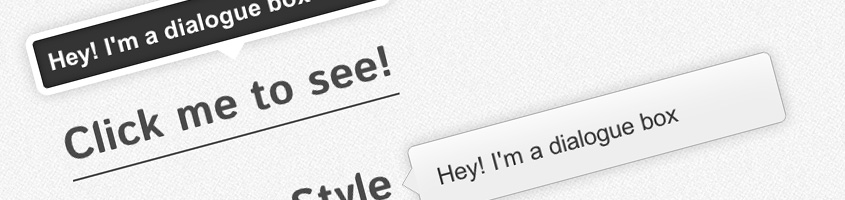
<form action="#" method="get">
<div class="container">
	<label for="activate">Click me to see!</label>
	<input type="checkbox" name="activate" id="activate" />
	<div class="type-1">Hey! I'm a dialogue box</div>
</div>
</form>
Let me summarize how this is going to work if you didn’t read the form method article. Basically, when the user clicks the label text, it will check the checkbox. We will then use a sibling selector to display the div when the checkbox is checked. We’re also going to be using transitions to accomplish the zoom out effect.
It’s probably worth mentioning at this point that support for the zoom out effect is not absolute, since transitions are not fully supported by all browsers. However, in those that don’t support transitions but support :checked, either naturally or by using Selectivizr, the dialogue box will just appear. This is acceptable, since usability is not really affected.
Writing the CSS
As I mentioned before, I dislike using 3D Transforms. The markup required because of vendor prefixes is unacceptable large. However, to accomplish this effect, I decided this was the easiest way to do things. Simply put, we’re going to set opacity to zero, and scale the dialogue box down to 0.1 of its actual size. Then when the user clicks (or checks) the label, the dialogue will be scaled back up, opacity increased to one, all over a smooth transition. The initial class, for those reasons, is quite long.
.container .type-1 {
	-moz-perspective: 1000;
	-webkit-perspective: 1000;
	-ms-perspective: 1000;

	-webkit-transform-style: preserve-3d;
	-moz-transform-style: preserve-3d;
	-ms-transform-style: preserve-3d;

	-webkit-transform: scale(0.1);
	-moz-transform: scale(0.1);
	-ms-transform: scale(0.1);

	-webkit-transition: all 0.2s ease-in;
	-moz-transition: all 0.2s ease-in;
	-ms-transition: all 0.2s ease-in;

	width: 300px;
	height: 25px;
	background: #343434;
	border: 7px solid #fff;
	box-shadow: inset 0px 0px 10px rgba(0,0,0,0.5), 0px 0px 20px rgba(0,0,0,0.2);
	border-radius: 10px;
	opacity: 0;
	padding: 10px;
	color: #fff;
	font-weight: bold;
	font-size: 22px;
	font-family: Arial, sans-serif;
	position: absolute;
	left: -10px;
	top: -80px;
	/* Always on top */
	z-index: 9999999;
}

/* A little triangle, to give context */
.container .type-1:after {
	width: 0;
	height: 0;
	content: "";
	color: #fff;
	border: 14px solid;
	border-color: white transparent transparent transparent;
	position: absolute;
	/* You may need to change the positioning if you restyle the dialogue */
	bottom: -33px;
	left: 50%;
}
After that it was just a caseof hiding the input, and changing the scale/opacity on click of the label/checkbox.
.container input {
	display: none;
}

.container input:checked + .type-1 {
	opacity: 1;
	-webkit-transform: scale(1);
	-moz-transform: scale(1);
	-ms-transform: scale(1);
}
And finally, just some positioning and text styling.
.container {
	width: 320px;
	margin: 0px auto;
	position: relative;
	top: 100px;
	text-decoration: none;
}

.container label {
	position: relative;
	border-bottom: 2px solid #000;
	margin: 0px auto;
	color: #000;
	cursor: pointer;
	font: 40px 'Istok Web', sans-serif;
	opacity: 0.7;
}
And that’s it folks! Check out the demo to see another example or download the files if you want to mess around yourself.


