3D Transforms are just one of the more refined parts of CSS3, although there is still quite a long way to go before all the kinks are worked out. In this article we’ll be going over the basics of 3D transforms, how to use them, and when to use them, including a bunch of examples!
Support
| Feature / Engine | Webkit | Gecko | Trident | Presto |
| 3D Transforms | Experimental | Experimental | Experimental | None |
Support has been progressively increasing. The specification itself is not a recommendation, and in fact it’s still in working draft stage. The basic properties seem to have been nailed down though, so it’s unlikely things will change to such a degree that they become unrecognizable.
To begin..
we need to understand how 3D Transforms work, so I’ve put together a little demo of a cube to give you an idea of how they operate. Creating a 3D object is pretty easy. All we need to do is set the transform style to 3D and set up a perspective. Then we can start to move shapes in 3D space. For the record, when we use a 3D property, we need to set all the vendor prefixes too. In this tutorial if I say the following:
perspective: 1000;
transform-style: preserve-3d;
transform: translateZ(100px);
You should (probably, unless its 2015) write these with all the vendor prefixes, like this:
/* Perspective */

-moz-perspective: 1000;
-ms-perspective: 1000;
-o-perspective: 1000;
perspective: 1000;

/* Transform Style */

-webkit-transform-style: preserve-3d;
-moz-transform-style: preserve-3d;
-o-transform-style: preserve-3d;
-ms-transform-style: preserve-3d;
transform-style: preserve-3d;

/* Transform */

-webkit-transform: translateZ(100px);
-moz-transform: translateZ(100px);
-ms-transform: translateZ(100px);
-o-transform: translateZ(100px);
transform: translateZ(100px);
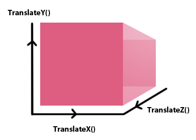
Still with me? Good. So to create this cube thing I keep going on about, it was just a case of setting the 3D stage and rotating the pieces accordingly. When you rotate something in CSS it rotates about a point in the middle, so we use translateZ() to move it to the appropriate position to line up with the other sides.
#cube { /* The cube holder */
	position: relative;
	top: 200px;
	transform-style: preserve-3d; /* Switch to 3D transforms */
	perspective: 1000; /* Set an appropriate perspective */
	width: 250px;
	height: 250px;
	margin: 0px auto;
}


#cube div {
	display: block;
	position: absolute;
	width: 200px;
	height: 120px;
	font-family: sans-serif;
	font-size: 40px;
	padding: 80px 0 0 0;
	font-weight: bold;
	color: #fff;
	text-align: center;
}

#cube .front {
	transform: translateZ(100px);
	background: rgba(171, 50, 50, 0.4);
}

#cube .back {
	transform: rotateX(-190deg) translateZ(100px); /* Multiple transforms separated by a space */
	background: rgba(171, 50, 50, 0.5);
}

#cube .right {
	transform: rotateY(90deg) translateZ(100px);
	background: rgba(171, 50, 50, 0.3);
}

#cube .left {
	transform: rotateY(-90deg) translateZ(100px);
	background: rgba(171, 50, 50, 0.6);
}
#cube .top {
	transform: rotateX(90deg) translateZ(100px);
	background: rgba(171, 50, 50, 0.8);
}
#cube .bottom {
	transform: rotateX(-180deg) translateZ(100px);
	background: rgba(171, 50, 50, 0.1);
}
Then just throw in some HTML to make everything work:
<div id="cube">
	<div class="front"> FRONT</div>
	<div class="back">BACK</div>
	<div class="right">RIGHT</div>
	<div class="left">LEFT</div>
	<div class="top">TOP</div>
	<div class="bottom">BOTTOM</div>
</div>
You can check out a quick demo of this here and download the file here. Changing the perspective will obviously change how the cube is viewed. You can try messing around with that yourself.
Problems!
In unsupported browsers you wont get any of the 3D stuff, and things can turn out pretty weird! If you create a two sided block, you’ll notice the rotated side is on top. Now this actually works out quite nicely, since we can have an introduction button style option on the ‘front’ side, and the actual content on the flipped side. Then Opera will just show the content and the other browsers will show a more interactive 3D rotation.
This becomes a problem though if the content and the flipped side are different sizes, as you end up with odd overlays of the two layers. You could apply a fixed size to the parent container and and set overflow: hidden; to fix this problem, although most of the time there will be other options available to you.
Messing around with ideas
So I came up with a few ideas using 3D Transforms. One of my main issues with 3D transforms is you need to define a width and height so that things dont go all weird. This can be a bit awkward for titles and stuff like that, as they usually need a certain degree of fluidity. Therefore I think that the best use of 3D transforms is on elements with a fixed with and height.
Twitter Button
This is perhaps one of the more simple ideas, but nonetheless a good way to start. I ran into some problems with z-index when trying to rotate the entire cube, so I found the easiest way was to rotate each side separately. This raises its own problems however as you can end up with some odd effects depending on how you configure the transform. Regardless, the HTML looked like this. I made the holder an anchor to avoid any problems with cross browser compatibility, so the whole thing stays clickable.
<div id="button-holder">
	<a href="https://twitter.com/share" id="button">
		<div class="front">TWITTER</div>
		<div class="top">TWEET</div>
	</a>
</div>
The CSS is just how you’d expect. Read the comments if you want to learn more!
#button-holder { // A holder, so we can insure that the hover effect works correctly.
	width: 190px;
	margin: 0px auto;
	height: 55px;
	position: relative;
	top: 200px;
}

#button { // Set up the 3D environment
	float: left;
	-webkit-transform-style: preserve-3d;
	-moz-transform-style: preserve-3d;
	-o-transform-style: preserve-3d;
	-ms-transform-style: preserve-3d;
	transform-style: preserve-3d;
	-webkit-perspective: 10000;
	-moz-perspective: 10000;
	-ms-perspective: 10000;
	-o-perspective: 10000;
	perspective: 1000;
}

#button div { // Transitions, shadows, font, basic stuff
	display: block;
	position: absolute;
	width: 170px;
	font-family: sans-serif;
	font-size: 30px;
	padding: 10px;
	font-weight: bold;
	color: #fff;
	text-align: center;
	box-shadow: inset 0px 35px 49px -25px rgba(255, 255, 255, 0.5);
	-webkit-transition: all 0.5s ease-in;
	-moz-transition: all 0.5s ease-in;
	-ms-transition: all 0.5s ease-in;
	-o-transition: all 0.5s ease-in;
	transition: all 0.5s ease-in;
}

#button {
	color: #fff;
	text-decoration: none;
}

#button .front { // Translate Z is used to fix a side intersects another side perpendicularly
	-webkit-transform: translateZ(0px);
	-moz-transform: translateZ(100px);
	-ms-transform: translateZ(100px);
	-o-transform: translateZ(100px);
	transform: translateZ(100px);
	background: #ccc;
	color: #000;
	border-bottom-left-radius: 5px;
	border-bottom-right-radius: 5px;
}

#button .top { // Often you'll have to rotate something in 3D space in order to position it correctly
	-webkit-transform: rotateX(90deg) translateZ(27px) translateY(-28px);
	-moz-transform: rotateX(90deg) translateZ(27px) translateY(-28px);
	-ms-transform: rotateX(90deg) translateZ(27px) translateY(-28px);
	-o-transform: rotateX(90deg) translateZ(27px) translateY(-28px);
	transform: rotateX(90deg) translateZ(27px) translateY(-28px);
	background: #37a7c7;
	border-top-left-radius: 5px;
	border-top-right-radius: 5px;
	text-shadow: 0 3px 0px rgba(0,0,0,0.1);
	position: relative;
}

#button-holder:hover #button .top {  // Then we can reset it on hover
	-webkit-transform: rotateX(0deg) translateZ(0px) translateY(0px);
	-moz-transform: rotateX(0deg) translateZ(0px) translateY(0px);
	-ms-transform: rotateX(0deg) translateZ(0px) translateY(0px);
	-o-transform: rotateX(0deg) translateZ(0px) translateY(0px);
	transform: rotateX(0deg) translateZ(0px) translateY(0px);
}

#button-holder:hover #button .front { // And rotate the initial front side to the bottom
	-webkit-transform: rotateX(-90deg) translateZ(27px) translateY(-28px);
	-moz-transform: rotateX(-90deg) translateZ(27px) translateY(-28px);
	-o-transform: rotateX(-90deg) translateZ(27px) translateY(-28px);
	-ms-transform: rotateX(-90deg) translateZ(27px) translateY(-28px);
	transform: rotateX(-90deg) translateZ(27px) translateY(-28px);
}
Check out a working example here. It adds another layer of interactivity onto something that could very well be bland. Obviously you could do this with other things, and not just twitter, although it’ll need some adjusting if you decide to change the width or height.
Rotating Cubes
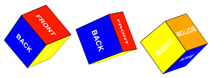
For our final example and the main piece of this tutorial we’re going to be making a rotating cube. We start out with the same idea as before. A cube. The HTML is the same as the first time we did it:
<div id="cube">
	<div class="front"> FRONT</div>
	<div class="back">BACK</div>
	<div class="right">RIGHT</div>
	<div class="left">LEFT</div>
	<div class="top">TOP</div>
	<div class="bottom">BOTTOM</div>
</div>
The CSS is similar too, with the exception that I added an animation to the cube. I am usually vehemently against using animations in a real world project, but this will give you an idea of what cool ideas can be achieved with 3D transforms.
#cube {
	position: relative;
	top: 200px;
	-webkit-transform-style: preserve-3d;
	-moz-transform-style: preserve-3d;
	-o-transform-style: preserve-3d;
	-ms-transform-style: preserve-3d;
	transform-style: preserve-3d;
	-webkit-perspective: 3000;
	-moz-perspective: 1000;
	-ms-perspective: 1000;
	-o-perspective: 1000;
	perspective: 1000;
	width: 250px;
	height: 250px;
	margin: 0px auto;
	-webkit-animation: cube 2s ease-in-out 0s infinite;
	-moz-animation: cube 2s ease-in-out 0s infinite;
	-o-animation: cube 2s ease-in-out 0s infinite;
	-ms-animation: cube 2s ease-in-out 0s infinite;
}

#cube div {
	display: block;
	position: absolute;
	width: 196px;
	height: 116px;
	font-family: sans-serif;
	font-size: 40px;
	padding: 80px 0 0 0;
	font-weight: bold;
	color: #fff;
	border: 2px solid #000;
	text-align: center;
}

#cube .front {
	-webkit-transform: translateZ(100px);
	-moz-transform: translateZ(100px);
	-ms-transform: translateZ(100px);
	-o-transform: translateZ(100px);
	transform: translateZ(100px);
	background: red;
}

#cube .back {
	-webkit-transform: rotateX(-90deg) translateZ(100px);
	-moz-transform: rotateX(-90deg) translateZ(100px);
	-ms-transform: rotateX(-90deg) translateZ(100px);
	-o-transform: rotateX(-90deg) translateZ(100px);
	transform: rotateX(-190deg) translateZ(100px);
	background: blue;
}

#cube .right {
	-webkit-transform: rotateY(90deg) translateZ(100px);
	-moz-transform: rotateY(90deg) translateZ(100px);
	-ms-transform: rotateY(90deg) translateZ(100px);
	-o-transform: rotateY(90deg) translateZ(100px);
	transform: rotateY(90deg) translateZ(100px);
	background: yellow;
}

#cube .left {
	-webkit-transform: rotateY(-90deg) translateZ(100px);
	-moz-transform: rotateY(-90deg) translateZ(100px);
	-ms-transform: rotateY(-90deg) translateZ(100px);
	-o-transform: rotateY(-90deg) translateZ(100px);
	transform: rotateY(-90deg) translateZ(100px);
	background: purple;
}
#cube .top {
	-webkit-transform: rotateX(90deg) translateZ(100px);
	-moz-transform: rotateX(90deg) translateZ(100px);
	-ms-transform: rotateX(90deg) translateZ(100px);
	-o-transform: rotateX(90deg) translateZ(100px);
	transform: rotateX(90deg) translateZ(100px);
	background: green;
}
#cube .bottom {
	-webkit-transform: rotateX(-180deg) translateZ(100px);
	-moz-transform: rotateX(-180deg) translateZ(100px);
	-ms-transform: rotateX(-180deg) translateZ(100px);
	-o-transform: rotateX(-180deg) translateZ(100px);
	transform: rotateX(-180deg) translateZ(100px);
	background: orange;
}
And finally, include the animation so the cube will rotate!
@-webkit-keyframes cube {
	0% { -webkit-transform: rotateX(45deg) rotateY(0deg) rotateZ(45deg); }
	100% { -webkit-transform: rotateX(45deg) rotateY(360deg) rotateZ(45deg); }
}
@-moz-keyframes cube {
	0% { -moz-transform: rotateX(45deg) rotateY(0deg) rotateZ(45deg);  }
	100% { -moz-transform: rotateX(45deg) rotateY(360deg) rotateZ(45deg);; }
}
@-o-keyframes cube {
	0% { -o-transform: rotateX(45deg) rotateY(0deg) rotateZ(45deg);  }
	100% { -o-transform: rotateX(45deg) rotateY(360deg) rotateZ(45deg); }
}
@-ms-keyframes cube {
	0% { -ms-transform: rotateX(45deg) rotateY(0deg) rotateZ(45deg); }
	100% { -ms-transform: rotateX(45deg) rotateY(360deg) rotateZ(45deg); }
}
A Quick Summary
The problem with 3D transforms and animations for that matter is that they require browser vendor prefixes which can become quite lengthy and leave you with not only messy code, but code that can take longer to load. Are browser prefixes necessarily a bad thing? That’s up for argument. However lack of support in Opera and the small inconsistencies across browsers should be enough to make you realise that really, 3D transforms aren’t ready to use yet. They are however quickly moving through the ranks of W3C testing, so one can hope that someday soon we can add them to our web design arsenal.


